Visual Identity for my passion project
About the project
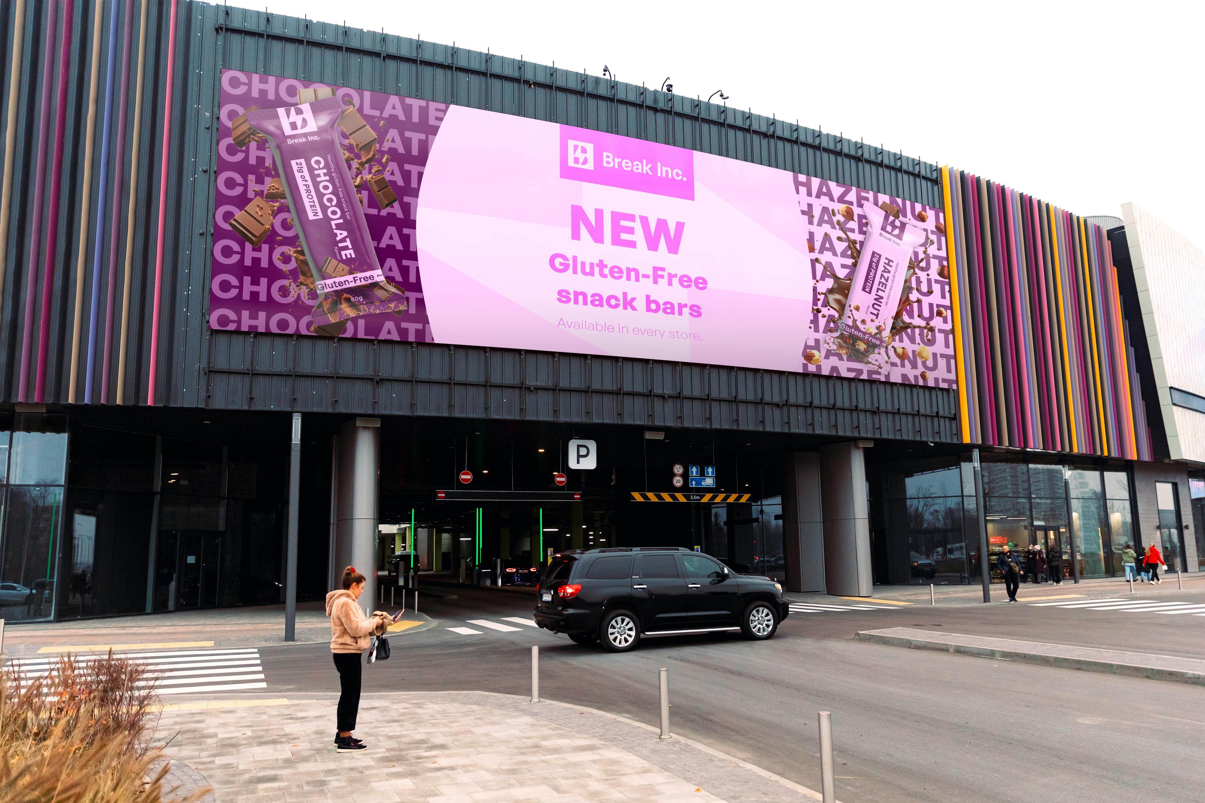
This bold and healthy snack bar was created with one goal in mind: to break people’s expectations. That’s why I chose colors that aren’t very traditional for chocolate bars — to make it stand out right away. From developing the visual identity to designing the packaging, this project was a great opportunity to challenge myself, try new things, and grow my design skills. The logo combines the letter B with a lightning bolt inside it — symbolizing the strength to break through anything in its path. The overall look was designed to feel more premium, yet still approachable and affordable.
Disclaimer: Whole company is completely fictional and it was only to showcase my ability in creating the Visual identity and to push myself and get better at graphic design.


